Skip to content

Services • Packaging & labels

Packaging that sells the product and passes the law.

BEND Creative is a Toronto packaging design agency for grocery and CPG brands. We design packs and label systems that look good enough to pick up, and carry everything Canadian law asks for, in English and French, from the first sketch.

Best for
Food, beverage and beauty brands selling in Canada
Includes
Packaging, label systems, dielines, bilingual compliance
Built by
Insiders from Canada’s largest grocery retailer

Built for the shelf, the law and the person packing it.

A shopper gives your pack a second or two. A regulator gives it a lot longer. We design for both.

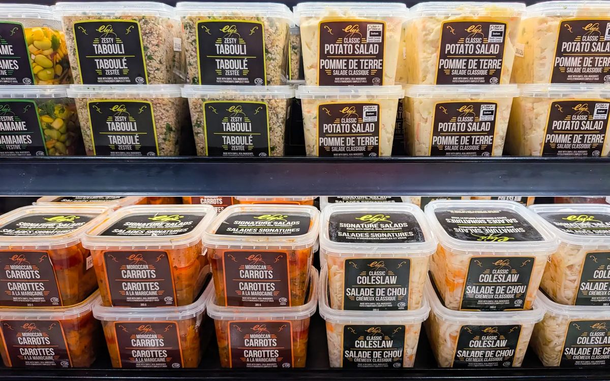
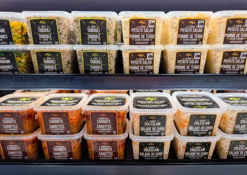
Good packaging starts as a system: one layout, one type family and one set of rules, so every flavour, size and new product looks related and still easy to tell apart. For Ely’s Fine Foods, that meant sixteen salads in one bilingual label system, each with its own colour pair you can read from the end of the aisle.

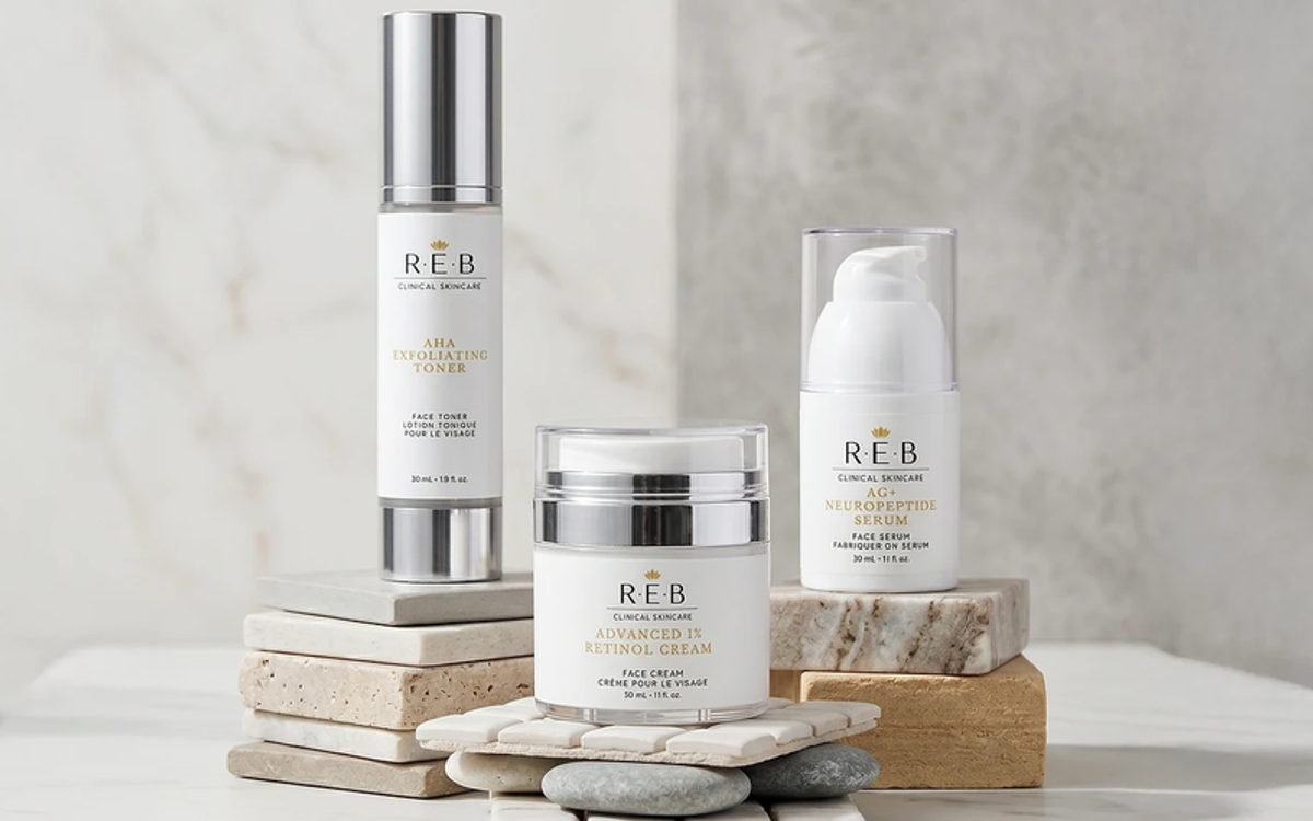
For REB Clinical Skincare, the same packaging system runs from serum bottles and gold cartons to the Shopify store, so the jar and the product page tell the same story.

  • Find itEach product easy to spot and tell apart at arm’s length.
  • Pass itEvery Canadian labelling rule, in both languages.
  • Scale itNew products slot into the system, not a new design.
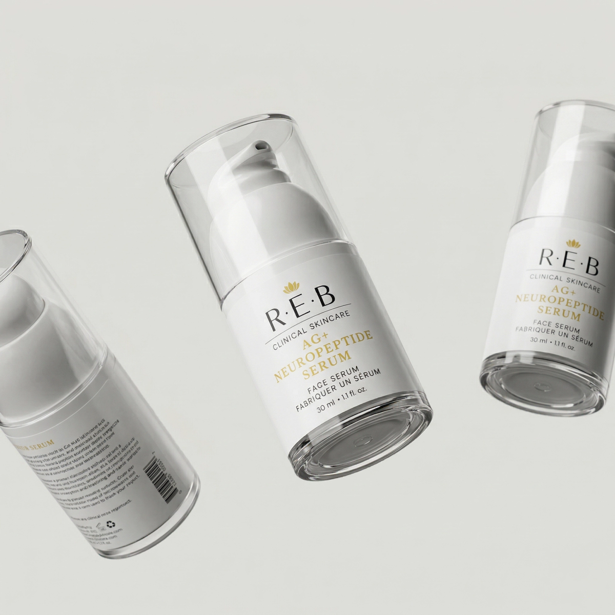
Three REB AG+ Neuropeptide Serum pump bottles showing the front label and the barcode panel

Compliance, from the first sketch.

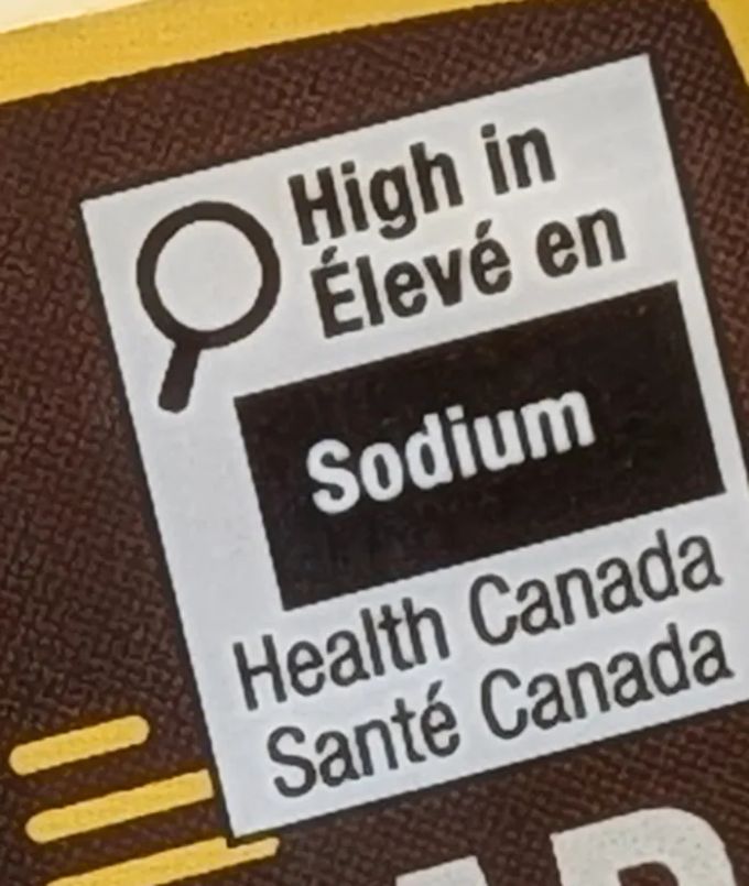
Close-up of the Health Canada front-of-pack symbol on an Ely’s label: High in / Élevé en Sodium, Health Canada / Santé Canada

Try the FOP Symbol Calculator

What we design into every Canadian food label.

  • Common name In English and French, with equal prominence.
  • Net quantity In metric, on the principal display panel.
  • Ingredients and allergens Both languages, in the right order.
  • Nutrition Facts table The Canadian bilingual format, not the US panel.
  • Front-of-pack symbol Health Canada’s “High in” symbol, at its legal minimum size.
  • Dealer name and address Who made it and where to find them.
  • Best-before date On foods that keep 90 days or less.
  • Quebec French Every inscription in French, none more prominent than it.

Need the front-of-pack symbol? Check in two minutes.

We turned the rules behind our labels into a free FOP Symbol Calculator.

Health Canada’s front-of-pack nutrition symbol became mandatory on January 1, 2026. Answer a few questions about your package and the calculator gives you the right “High in” format, its smallest legal size, the clear space around it and where it can go. Free, with no sign-up.

  • The formatThe right layout for your pack.
  • The sizeMinimum width and clear space, in millimetres.
  • The spotWhere on the label it’s allowed.
Try the FOP Symbol Calculator
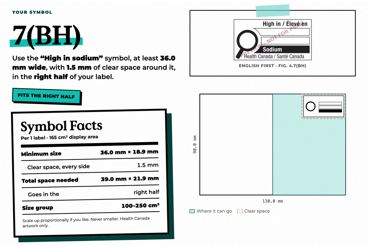
The FOP Symbol Calculator’s answer for a 130 × 90 mm label high in sodium: the symbol format, its minimum width and clear space, and where it can go on the label

How a packaging project runs.

The proof

Packaging we’ve shipped.

Packaging design, answered.

What does a CPG packaging design agency do?

It designs the packs and labels a consumer product sells in: the structure and dieline, the layout and graphics, and a label system that works across every flavour and size. In Canada it also means building in the legal requirements, in English and French, before anything goes to print.

Do food labels in Canada have to be bilingual?

Yes. Mandatory information has to appear in English and French with equal prominence. In Quebec, the Charter of the French Language goes further: every inscription on the product needs French, and no other language can be more prominent.

When does a food need Health Canada’s front-of-pack symbol?

When it’s high in saturated fat, sugars or sodium. The symbol became mandatory on January 1, 2026, and its minimum size depends on the size of the package. Our free FOP Symbol Calculator works out the format, size and placement for your pack.

Can US packaging be sold in Canada as is?

Rarely. Canada needs bilingual labelling, a Canadian-format Nutrition Facts table, metric net quantities and, where it applies, the front-of-pack symbol. Most US packs need a redesign for Canada, not a sticker.

Do you prepare dielines and print-ready files?

Yes. We plan the dieline around the real pack, keep important information away from corners and seams, and hand over print-ready files.

Who is BEND Creative?

BEND Creative is a Toronto creative agency for grocery and CPG brands, built by insiders from Canada’s largest grocery retailer. Services include brand identity, CPG packaging and labels, retail and in-store signage, and social and campaigns.

  • CPG packaging
  • label systems
  • dielines
  • bilingual labelling
  • front-of-pack compliance
  • Nutrition Facts tables
  • Quebec French
  • cartons
  • print production

More from BEND

One team, from the pack to the post.

Selling in Canada? Let’s talk packaging.

Tell us about your product. The coffee’s on us.