Skip to content

Packaging that works two shifts.

REB Clinical Skincare needed a luxury brand built from scratch: an identity, packaging for a full product line, and a Shopify store to sell it. BEND Creative designed all three, so the jar on the counter and the product page on the phone tell the same story.

Client
REB Clinical Skincare
Category
Clinical skincare
Scope
Brand, packaging, Shopify

Clinical enough to trust. Luxe enough to want.

The brief was a premium clinical skincare line with a curated range of products, a polished visual identity and an elevated online store.

Skincare shoppers judge a product twice. First on a shelf or a bathroom counter, where the pack has to look expensive and read clearly. Then on a phone, where the same pack is a few hundred pixels wide next to a price and a buy button. We designed one system for both.

  • On shelfRetail-ready packs that read clean at arm's length.
  • On screenA Shopify store built from the same system.
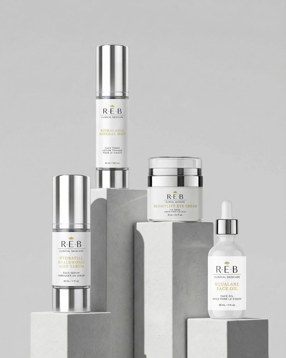
REB Clinical Skincare product line on concrete plinths: two serums, an eye cream, a face oil and a pump bottle

Shift one: packaging for the shelf.

A skincare line is a family of packs that have to look related and still be easy to tell apart. We designed the REB identity, a label system for every product, and the cartons they ship in.

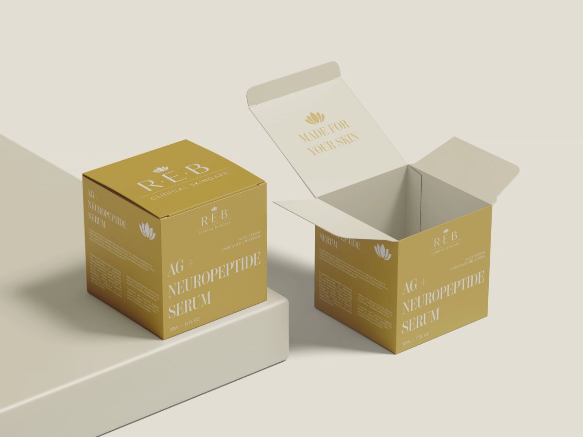
Two gold REB cartons for AG+ Neuropeptide Serum, one open to show a printed message inside the lid

A carton worth opening.

The carton flips the palette to solid gold so it stands out on a shelf, and a message inside the lid rewards whoever opens it.

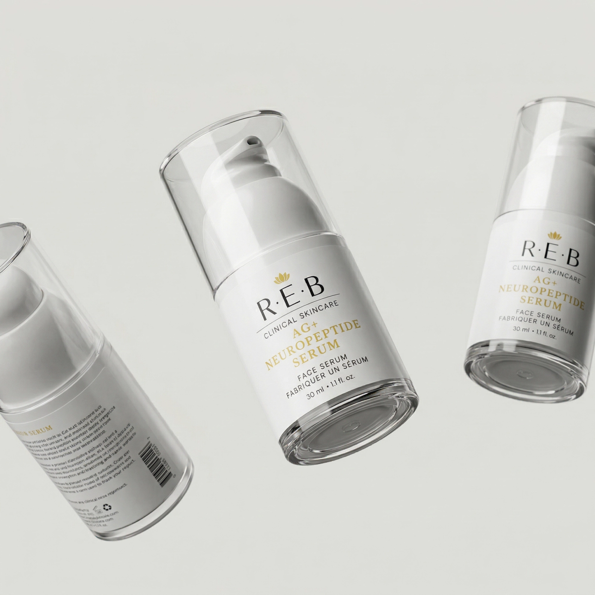
Three REB AG+ Neuropeptide Serum pump bottles showing the front label and the barcode panel

One label system for every product.

Brand, product name in gold, then type and size in English and French. Every product follows the same order.

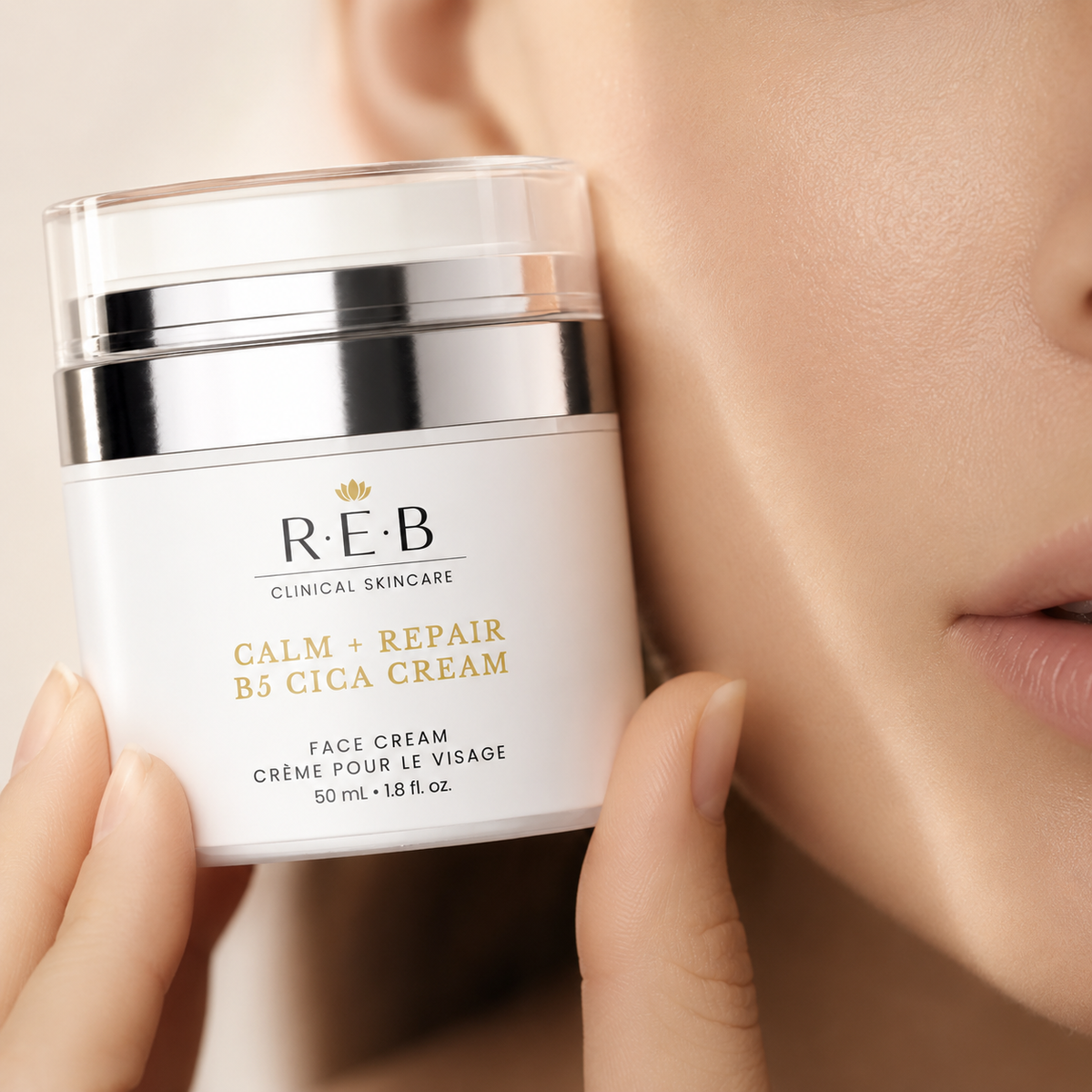
Hand holding an REB Calm + Repair B5 Cica Cream jar beside the face

Readable in someone's hand.

The product name sits large on every jar, so it reads in ads, reviews and creator videos.

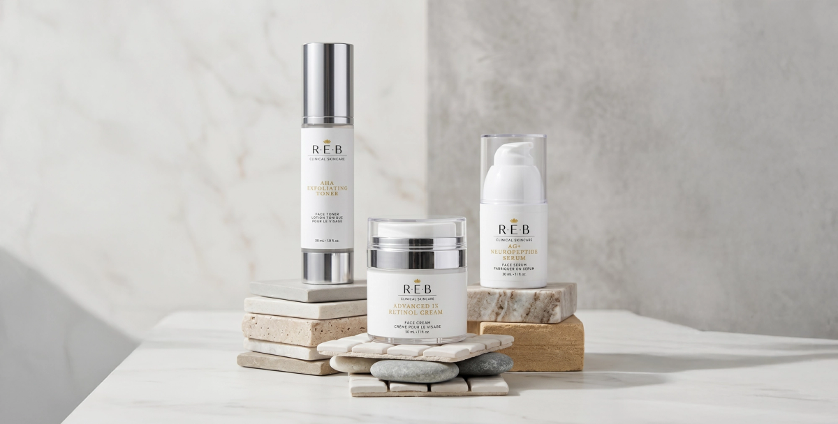
REB serum, cream jar and pump bottle styled on stacked stone and marble

Built to scale across the range.

Serums, creams, an eye cream and a face oil share one frame. New products slot in without new design work.

REB Clinical Skincare logo printed on textured card over white marble

A mark that fits on 30 mL.

Spaced capitals, one rule and a small gold lotus. Calm and clinical at label size, premium on paper.

REB business card with a soft iridescent edge, leaning on grey concrete

Down to the business card.

The same type, gold and white space carry through to stationery.

Shift two: a Shopify store for the screen.

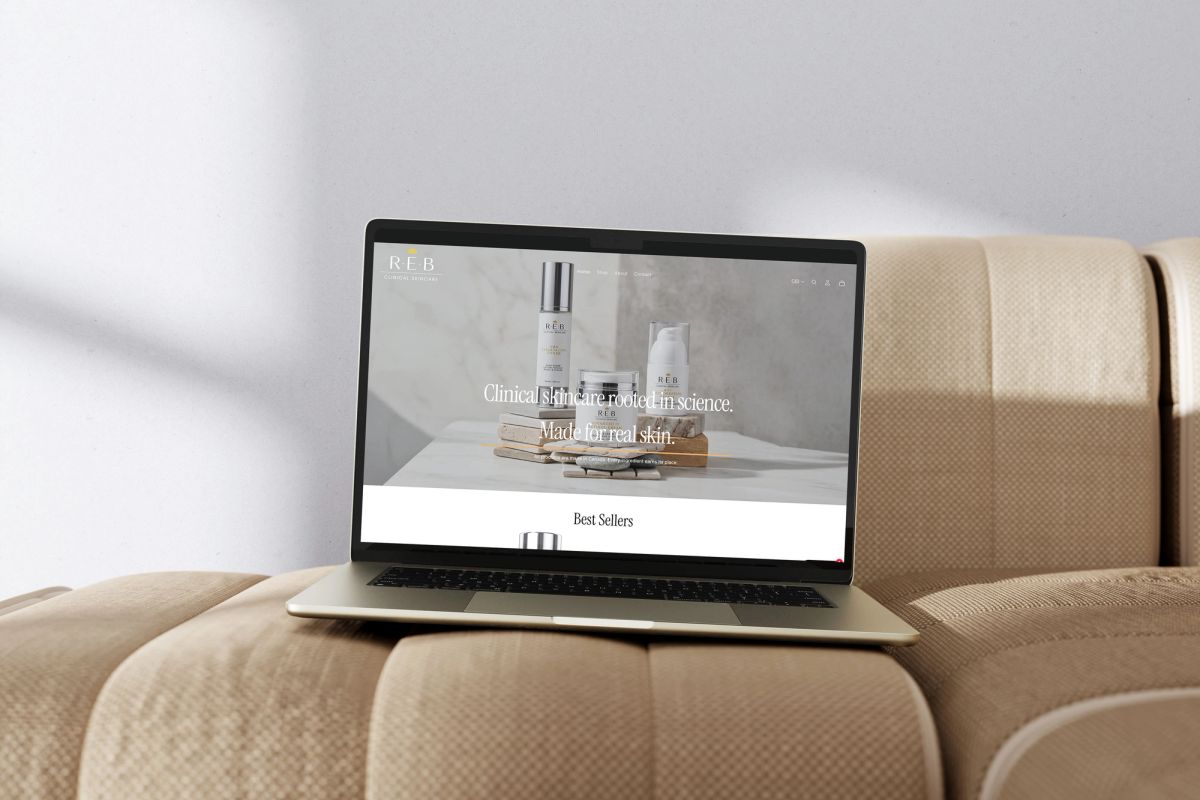
We designed and built REB's Shopify store from the same system as the packaging: the same type, the same gold and the same imagery. The homepage opens on the brand promise, “Clinical skincare rooted in science. Made for real skin.” Best sellers sit right below it. Someone who saw the jar in a video recognises the brand the moment the site loads.

REB Clinical Skincare Shopify homepage on a laptop: hero headline Clinical skincare rooted in science, made for real skin, above a Best Sellers row

One team for the pack and the product page.

Most brands hire a packaging designer and a web shop separately, then spend months making the two match. We do both, so the product page uses the same files and photography as the box.

  • Packaging design

    • Brand identity and logo
    • Label system across every product
    • Cartons and print-ready dielines
    • Bilingual English and French copy layout
    • Pack renders and product imagery
  • Shopify design and build

    • Store design styled to the brand
    • Theme build and customization
    • Homepage and best-seller merchandising
    • Product and collection pages
    • Imagery sized for the digital shelf

Packaging and Shopify, answered.

What did BEND Creative design for REB Clinical Skincare?

The brand identity, packaging for the full product line (serum bottles, cream jars, a face oil and gold outer cartons), product imagery, business cards and the brand's Shopify store.

What does skincare packaging need to sell in Canada?

Labels sold in Canada carry English and French text and a metric net quantity, and cosmetics need an ingredient list. Designing that into the label system from day one avoids reworking every SKU later.

How do you design packaging that works on shelf and online?

Keep the hierarchy simple and the product name large. A pack that reads clearly at arm's length also reads clearly as a thumbnail on a product page or in an ad. Then build the online store from the same type, colour and imagery so the brand feels the same in both places.

Does BEND Creative build Shopify stores?

Yes. BEND designs and builds Shopify stores for grocery, CPG and beauty brands, often alongside their packaging, so the pack and the product page come from one system.

Who is BEND Creative?

BEND Creative is a Toronto creative agency for grocery and CPG brands, built by insiders from Canada's largest grocery retailer. Services include brand strategy, social and campaigns, CPG packaging, retail and in-store marketing, and Canadian legal compliance.

  • packaging design
  • label systems
  • cartons & dielines
  • bilingual compliance
  • brand identity
  • product imagery
  • Shopify design
  • Shopify build
  • e-commerce
  • art direction

Let's make something that sells.